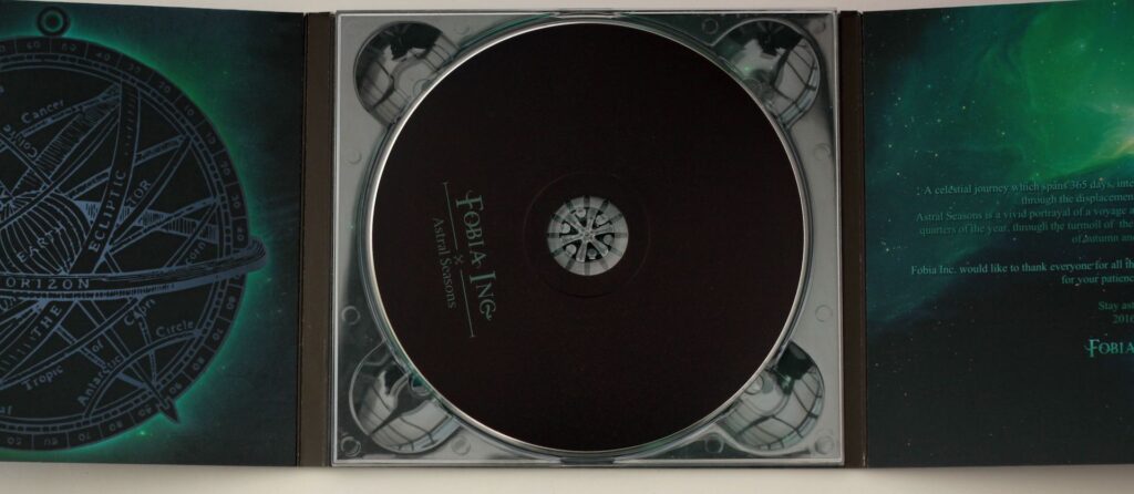
50 Disc(Colour) in Digipak 6 panel (colour) £199,
100 Disc(Colour) in Digipak 6 panel (colour) £279,
200 Disc(Colour) inDigipak 6 panel (colour) £419,
300 Disc(Colour) in Digipak 6 panel (colour) £579,
400 Disc(Colour) in Digipak 6 panel (colour) £699,
500 Disc(Colour) in Digipak 6 panel (colour) £769,
Need More? Contact Us
Shrink wrap option, Unique Barcode for the Shop Scanners option,
inc delivery in UK, Northern Ireland, Ireland, EU(additional options)
A digipak (also spelled digipack) is a fold-out cardboard package commonly used for CDs or DVDs. It usually has one or more plastic trays glued inside to hold the discs, and may include a booklet, lyrics, or additional artwork. It’s a more customizable, paper-based alternative to a plastic jewel case.
For strong digipak artwork, design around the physical package rather than treating it like a flat album cover:
Digipack artwork Design tips
- Start with the template below. Digipaks vary—4-panel, 6-panel, CD/DVD trays, booklet pockets, and spine widths all affect the layout.
- Use CMYK at 300 dpi. Keep important text and faces away from folds, cut lines, and glued areas.
- Add bleed. Extend backgrounds and images beyond the trim edge, usually by 3 mm or the printer’s specified amount.
- Plan the panel sequence carefully. Print a paper mock-up and fold it to check which panels become the front, back, inside cover, and spine.
- Make the front instantly readable. Use a clear focal image, strong contrast, and an artist/title treatment that remains legible at thumbnail size.
- Use the spine effectively. Include the artist and release title, oriented according to the manufacturer’s template.
- Keep the back cover functional. Leave room for the track list, credits, barcode, copyright details, and label information without overcrowding it.
- Design the inside panels intentionally. Lyrics, credits, photography, liner notes, or a visual continuation of the front can make the package feel complete.
- Check fold and tray conflicts. A CD tray may cover artwork, while folds can cut through faces, logos, or text.
- Limit fonts and effects. Two or three typefaces, consistent spacing, and a restrained color palette usually look more professional.
- Create visual continuity. Repeat colors, textures, symbols, or photographic elements across the panels so it feels like one object.
- Proof everything physically. Print at approximate size, fold it, insert a disc, and inspect it under normal lighting before exporting.
- Export according to the printer’s requirements. Typically this means a press-quality PDF with embedded fonts, linked images included, bleed enabled, and any required cutter/spot-color layers handled correctly.
A useful basic file setup is: 300 dpi, CMYK, 3 mm bleed, safe margins inside trim, and separate clearly labeled layers for artwork, text, guides, and printer marks.
For a more distinctive result, consider making the front cover visually simple and using the interior panels for the detailed story, lyrics, credits, or more experimental imagery.